

This note explains why people live where they do, how crowded different places are, and how birth and death rates shape a country's age structure over time. It covers the physical and human factors governing population distribution and density, the concepts of carrying capacity and overpopulation, the influence of society and culture on fertility, the Demographic Transition Model, and the analysis of population pyramids and dependency ratios.
Population Distribution and Density
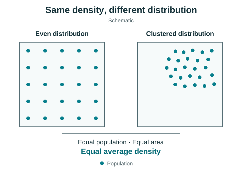
Understanding Distribution and Density
Population distribution describes the spatial spread of people across the land, highlighting where settlement clusters and where it remains sparse. Worldwide, distribution is strikingly uneven: roughly 90% of humanity lives in the Northern Hemisphere, mainly in temperate and subtropical zones between 20°N and 60°N.
Population density measures the average concentration of people living per square kilometre of land:
Worked density example (Ireland, 2020 data): Total population = 4,963,000; Total area = 70,273 km².
Always state the unit (people per km²) and round to one decimal place if requested. (The subsequent rise to roughly 73 people per km² by Census 2022 reflects national population growth on the same land area.)
Density figures are most useful for comparison. Ireland (roughly 73 people per km² in 2022) is sparsely populated compared with the Netherlands (over 500 people per km²). National averages also mask stark regional contrasts. In Ireland, Dublin City has over 4,500 people per km², and County Dublin as a whole contains about 28% of the national population, while County Leitrim has roughly 22 people per km² and parts of the Connemara Gaeltacht fall below 10 people per km².
Physiological Density
Arithmetic density divides total population by total surface area, including bogs, lakes, and barren mountains. Physiological density measures real pressure on food-producing land by calculating the number of people per square kilometre of arable (cultivated) land. In Egypt, about 95% of the population lives on roughly 5% of the land area along the narrow Nile valley and delta, creating an extreme physiological density where thousands of people depend on each square kilometre of fertile alluvial soil.
Physical and Human Factors Governing Settlement
Where people live depends on physical opportunities and human history working together.
Physical Factors
- Relief and altitude: Lowland plains below 500 metres host over 80% of the global population. Flat terrain lowers the cost of building roads, railways, and homes, and allows mechanised farming. In contrast, steep mountain ranges like the Alps or the Himalayas restrict settlement due to thin acidic soils, difficult transport, and harsh climates.
- Climate: Temperate climates provide comfortable temperatures and reliable rainfall for year-round crop growth. Extreme cold in polar regions like Antarctica and acute water shortages in hyper-arid deserts like the Sahara prevent farming, keeping populations sparse.
- Drainage and soils: River floodplains provide fresh drinking water, domestic supply, and rich alluvium for crops. Over 90% of Egypt's population clusters within easy reach of the River Nile for irrigation and fertile silt.
- Natural resources: Mineral and fuel deposits attract settlement to harsh environments, such as iron-ore mining at Kiruna in northern Sweden and isolated mining towns in the Australian outback.
Human Factors
- Historical legacy: The Great Famine (1845–1849) altered Ireland's human landscape. About one million people died of starvation and famine-related disease, and about one million emigrated, initiating a century of rural decline particularly in the west.
- Government policy: Governments can deliberately redistribute populations. In the 1950s and 1960s, Brazil constructed its planned inland capital, Brasília, to draw administrative jobs and residents away from overcrowded coastal hubs like Rio de Janeiro.
- Economic development: Regions with expanding industries attract inward migration. During the Celtic Tiger era and the post-2011 recovery, Ireland drew tens of thousands of workers into Dublin and major regional cities.
Carrying Capacity, Overpopulation, and Socio-Cultural Influences
Key Population Concepts
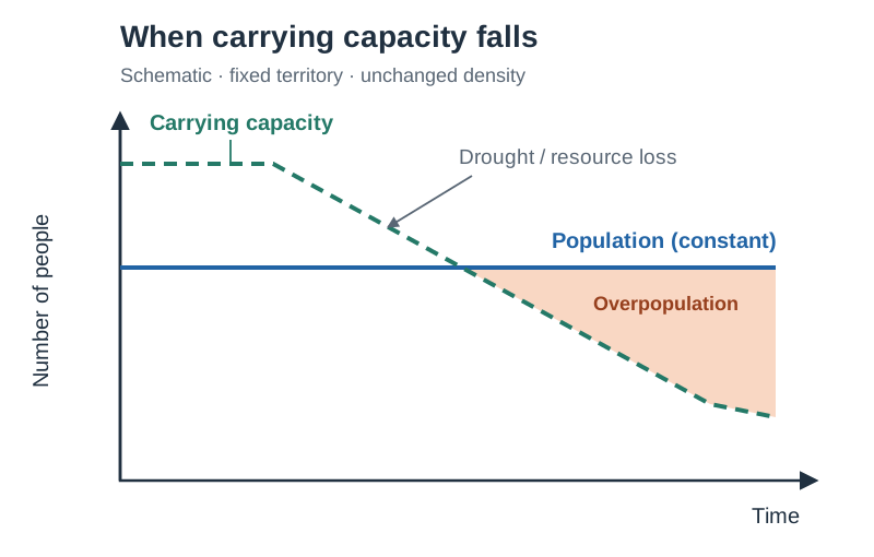
Carrying capacity is the maximum population that the natural resources and technology of a given environment can support sustainably at an acceptable standard of living without causing environmental collapse.
- Overpopulation happens when a population exceeds the carrying capacity of its territory. It is not simply high population density. The Netherlands has a high density of over 500 people per km² but is not overpopulated because modern farm technology, manufacturing, and global trade deliver high living standards. In contrast, Mali has an arithmetic density of roughly 15 people per km² but experiences severe overpopulation in parts of the Sahel, where drought, thin soils, and overgrazing trigger desertification and food deficits.
- Underpopulation occurs when an area has surplus natural resources but too few workers to exploit them efficiently. Countries like Australia and Canada use targeted economic immigration schemes to resolve domestic labour shortages.
- Optimum population is the theoretical ideal where the population size, matched with resources and technology, achieves the highest possible standard of living. Because birth rates, technology, and trade shift constantly, no country maintains optimum population for long.
Causes of Overpopulation (Syllabus Headings)
- Resource development: Poor agricultural management, soil exhaustion, and drought reduce carrying capacity, as in the African Sahel.
- Income levels: In low-income subsistence economies, children are essential sources of agricultural labour and provide security in old age. High-income economies treat children as financial commitments, lowering fertility.
- Technology: Medical advances such as childhood vaccinations, antibiotics, and clean water supplies reduce mortality rates rapidly before cultural attitudes to family size can change.
- Society and culture: Traditional social structures and beliefs strongly govern family size.
How Society and Culture Influence Population
Societal values and cultural traditions play a central role in shaping birth rates and population growth:
- Women's status and education: Where female status is low and educational opportunities are restricted, women often marry young and have little control over family planning. In rural parts of countries like India, lower female literacy rates and early marriage (with UNICEF estimating that roughly one in four young women in India were married before age 18) contribute to sustained high fertility. As female education and workforce participation rise, women delay marriage and childbearing, causing birth rates to decline.
- Religious beliefs and institutions: Many major religious institutions discourage artificial contraception and view large families as a moral virtue. In Ireland, strong Roman Catholic influence until the late 1970s supported high birth rates and restricted access to family planning; as religious influence subsequently diminished, fertility dropped significantly.
- Economic role of children: In developing agricultural societies, children are viewed as economic assets who assist with farm labour and provide security for elderly parents where state pensions do not exist. High infant mortality also encourages families to have more children to ensure several survive to adulthood.
- Gender preference: In several traditional societies, a strong preference for male heirs (who inherit land, carry on family names, or attract dowries) leads couples to continue having children until sons are born.
Components of Population Change and the Irish Case Study
Components of Population Change
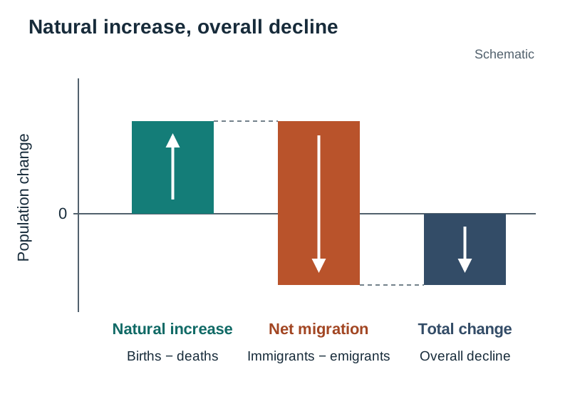
Overall population change depends on two factors:
- Natural change = live births − deaths. When births exceed deaths, the result is natural increase.
- Net migration = immigrants − emigrants. It is positive when more people arrive than leave.
Even with a natural increase, total population can fall if net emigration is larger. This occurred in Ireland between 1986 and 1991.
Percentage-change formula:
Worked percentage-change example (Ireland, 2016–2022):
- Old value (2016) = 4,761,865; New value (2022) = 5,149,139
Remember to divide by the original (old) value, not the new one.
Case Study: Ireland's Population Change, 1841–2022
- 1841: The population stood at 6,528,799 (Republic of Ireland area), supported by intensive potato cultivation and sub-divided smallholdings.
- 1845–1849: The Great Famine struck. Potato blight caused roughly one million deaths from starvation and famine-related disease, while one million emigrated.
- 1851–1961: A prolonged decline caused by heavy emigration, late marriage, and high celibacy rates pushed the population to an all-time low of 2.82 million in 1961.
- 1960s–1980s: Economic modernisation slowed emigration, and high fertility (total fertility rate around 3.2 in 1980) maintained natural increase, despite an economic slump and renewed emigration in the late 1980s.
- Celtic Tiger (mid-1990s–2007): Economic boom produced net inward migration, including returning emigrants and workers from the 2004 EU accession states (such as Poland and Lithuania).
- 2008–2012: Recession caused renewed emigration of young graduates.
- 2011–2022 (economic recovery): Growth returned through natural increase (births still exceeding deaths) and net inward migration, as jobs attracted foreign workers and returning Irish emigrants.
- Census 2022: Population reached 5,149,139, surpassing 5 million for the first time since 1851.
Between 2016 and 2022, Ireland grew by 387,274 people:
| Component (2016–2022) | Figure |
|---|---|
| Natural increase | +171,338 |
| Net migration | +215,936 |
| Total change | +387,274 |
Change between 1841 and 2022: people.
The Demographic Transition Model (DTM)
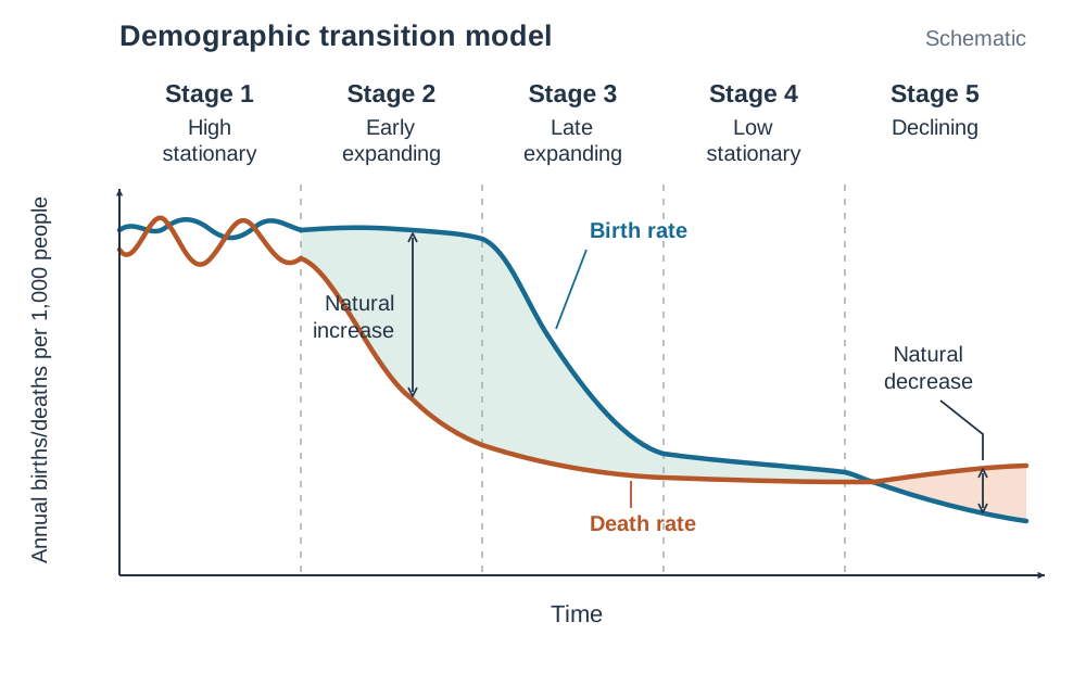
The Demographic Transition Model explains how birth rates and death rates change as an economy develops. In a DTM diagram, time is plotted on the horizontal axis, and birth and death rates per 1,000 people are plotted on the vertical axis. The gap between the birth rate and death rate lines represents natural increase or natural decrease.
The Five Stages
- Stage 1 – High Stationary: High birth rates and high, fluctuating death rates. Population growth is slow and unstable. Death rates fluctuate due to famine, epidemics, and lack of clean water. No country is in Stage 1 today; pre-Famine Ireland is a historical example.
- Stage 2 – Early Expanding: Death rates fall rapidly due to clean water, basic medical supplies, and better sanitation, while birth rates remain high. Population expands rapidly. Examples: Mali, Niger.
- Stage 3 – Late Expanding: Birth rates decline steadily due to female education, urbanisation, and access to contraception, while death rates continue to decline slowly. Population growth decelerates. Examples: Kenya, India.
- Stage 4 – Low Stationary: Low birth rates and low death rates produce a stable or slowly growing population. Ireland, France, and the USA are in Stage 4.
- Stage 5 – Senile / Declining: The birth rate falls below the death rate, producing natural decrease and an ageing population. Examples: Japan, Italy, Germany.
Why Birth Rates Fall After Stage 2
- Falling infant mortality means parents no longer have extra children to ensure some survive.
- Women remain longer in secondary and third-level education and enter the formal workforce.
- Modern artificial contraception and family planning clinics become widely accessible.
- In urban settings, children become financial dependants rather than agricultural assets.
Stage 5 Challenges
A shrinking working-age population must support a rising proportion of elderly citizens. This raises the old-age dependency ratio and strains pension reserves, nursing home capacity, and public hospital budgets.
Demographic Structures, Pyramids, and Dependency
Population Pyramids
A population pyramid is a dual horizontal bar chart displaying the age and sex breakdown of a population. Five-year cohorts rise from the base (births) to the top (elderly cohorts), with males on the left and females on the right.
| Pyramid Type | DTM Stage | Shape Profile | Demographic Characteristics | Examples |
|---|---|---|---|---|
| Progressive | Stage 2 | Wide triangular base, steeply tapering sides | High birth rate, high infant mortality, low life expectancy | Niger, Mali |
| Transitional | Stage 3 | Narrowing triangular base, broader middle | Falling birth rate, declining death rate, rising life expectancy | Kenya, India |
| Stationary | Stage 4 | Straight-sided, tapering slightly at top, narrowing base | Low birth rate (at or below replacement), low death rate, long life expectancy | Ireland, France |
| Regressive | Stage 5 | Beehive or urn shape, narrow base, wide top | Birth rate below death rate, large elderly population, natural decrease | Japan, Italy, Germany |
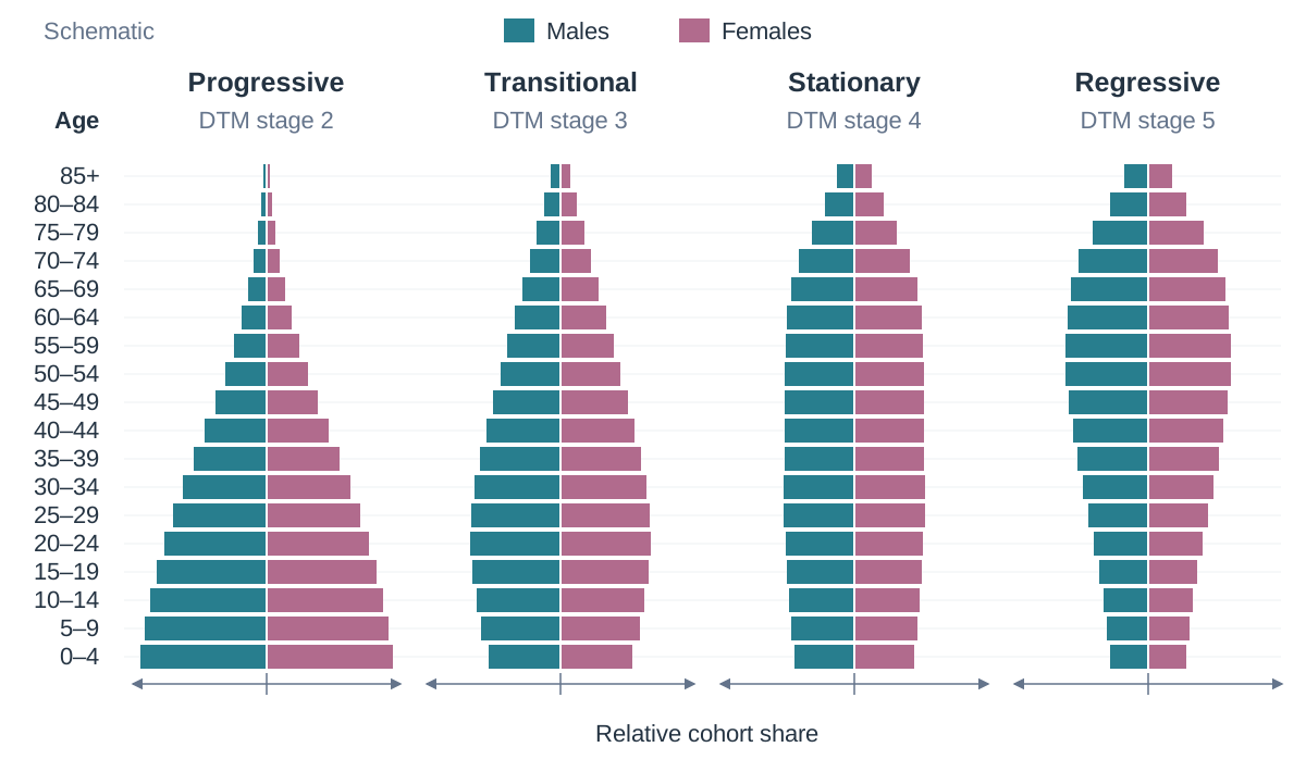
Reading a Population Pyramid
- Check the horizontal axis: identify whether values show percentages or raw numbers.
- To find the total share of an age cohort, sum the male and female bars.
- Identify historical shocks: bulges show baby booms or inward migration of workers; notches show wars, past famines, or periods of heavy emigration.
- Note gender divergence: bars for females are almost always longer in the 75+ and 85+ cohorts because women have a longer life expectancy.
The Dependency Ratio
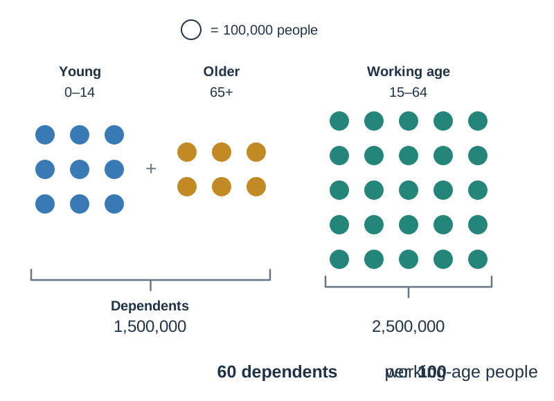
The dependency ratio measures the proportion of dependents supported by the working-age population:
Worked census scenario:
- Young dependents (aged 0–14) = 900,000
- Elderly dependents (aged 65+) = 600,000
- Working-age population (aged 15–64) = 2,500,000
This means there are 60 dependents for every 100 people of working age.
Key terms
- Population Distribution
- The spatial pattern of where people live across a region or the world.
- Population Density
- The average number of people living per square kilometre of total land area.
- Physiological Density
- The number of people supported per square kilometre of arable (agriculturally productive) land.
- Birth Rate
- The number of live births per 1,000 people in a population in one year.
- Death Rate
- The number of deaths per 1,000 people in a population in one year.
- Infant Mortality Rate
- The number of babies who die before their first birthday per 1,000 live births.
- Total Fertility Rate (TFR)
- The average number of children a woman is expected to have during her childbearing years.
- Replacement Level
- The total fertility rate needed for a population to replace itself from generation to generation without migration (roughly 2.1 births per woman).
- Life Expectancy
- The average number of years a person born in a given year can expect to live.
- Natural Change
- The difference between live births and deaths in a population over a given period, excluding migration.
- Net Migration
- The difference between the number of immigrants entering a country and the number of emigrants leaving it over a specific period.
- Carrying Capacity
- The maximum population that an area's natural resources and technology can sustainably support at an acceptable standard of living.
- Overpopulation
- The condition where a population exceeds the carrying capacity of its environment and available technology.
- Underpopulation
- The condition where a territory contains surplus natural resources but too few people to exploit them efficiently.
- Optimum Population
- The theoretical ideal population size that achieves the highest possible standard of living from available resources and technology.
- Population Pyramid
- A dual horizontal bar graph illustrating the age cohort and gender structure of a population.
- Dependency Ratio
- The ratio of dependents (ages 0–14 and 65+) per 100 people of working age (ages 15–64).
Check yourself
What is the difference between arithmetic density and physiological density?
Arithmetic density divides total population by total land area, whereas physiological density divides total population only by productive agricultural (arable) land, reflecting real pressure on food production.
A county has 30,000 children (aged 0–14), 20,000 pensioners (aged 65+), and 100,000 adults (aged 15–64). Calculate its dependency ratio.
Total dependants = 30,000 + 20,000 = 50,000. Apply formula: (50,000 / 100,000) * 100 = 50. The dependency ratio is 50 dependants per 100 people of working age.
Name Stage 1 of the Demographic Transition Model and identify which stage Ireland is currently in.
Stage 1 is the High Stationary stage. Ireland is currently in Stage 4 (Low Stationary).
In a given year, a country records 60,000 live births, 35,000 deaths, 80,000 immigrants, and 45,000 emigrants. Calculate the natural increase and the total population change.
Natural increase = 60,000 - 35,000 = +25,000. Net migration = 80,000 - 45,000 = +35,000. Total population change = 25,000 + 35,000 = +60,000.
What evidence on a population pyramid shows that women live longer than men?
The horizontal bars for females are longer than those for males in the oldest age cohorts at the top of the pyramid (specifically the 75–84 and 85+ age groups).