
After 1960, artists stopped treating fine art as something separate from ordinary life. Instead of the monumental abstract canvases of the 1950s, which were meant to express private psychological drama, artists began using the materials and images around them: advertising, supermarket packaging, comic strips, television broadcasts, their own bodies, the landscape, and computer code. The big idea of the period is that almost anything can become art if the artist chooses it, frames it with critical intent, and gives the viewer a reason to look. On the Leaving Certificate specification, Post 1960 appears twice: once under Content Area 1 (Europe and the wider world) and once under Content Area 2 (Ireland and its place in the wider world). They are separate areas of study and are examined in separate questions. This topic note focuses on Europe and the wider world (including figures such as Andy Warhol, Roy Lichtenstein, Richard Hamilton, Anselm Kiefer, Rachel Whiteread, Barbara Kruger, Cindy Sherman, and Jean-Michel Basquiat). If you are also preparing the Irish post-1960 option, you must have a distinct group of Irish artists ready, such as Willie Doherty, Dorothy Cross, Rita Duffy, and Kathy Prendergast. To earn high marks, you must analyse works through the official Visual Studies Framework. This means answering three core questions about every artwork: What was created? How was it created? and Why was it created? Your answers must connect Context, Artists and Artworks, Visual Analysis, Art Elements and Design Principles, Media and Areas of Practice, and Innovation across three distinct phases: Before the movement, During the movement, and After the movement.
The Visual Studies Framework and the Post-1960 Context
To structure an examination answer effectively, use the six elements of the Visual Studies Framework as an essay plan:
- Context: The historical, political, social, and economic backdrop, including patronage, gallerists, and collectors.
- Artists and artworks: Recognised figures, accurate titles, dates, and the artist's personal intent. For the exam, always choose recognised artists whose work is held in major public collections and discussed in standard art history texts.
- Analysis: Asking what is happening in the work and finding visible evidence to support your reading.
- Art elements and design principles: The formal building blocks (line, shape, form, colour, tone, texture, space, pattern) and how they are organised (balance, contrast, emphasis, rhythm and repetition, proportion, scale, unity).
- Media and areas of practice: The physical handling, capabilities, and limits of the medium (from oilstick and silkscreen to concrete casting and live action).
- Innovation and invention: How new tools, industrial fabrication, lens technologies, or computing reshaped what art could be.
Key Historical Contexts After 1960
Examiners consistently reward answers that cite specific context rather than generalised background. Match these dated events to the artists you write about:
- 1950s–1960s: The post-war consumer boom, television entering private homes, and mass supermarket branding (Hamilton, Warhol, Lichtenstein).
- 1955–1975: The Vietnam War, broadcast nightly on news television (Warhol's Death and Disaster series, Lichtenstein's war comic canvases).
- 1960s: The US civil rights movement and its continuing struggle against institutional racism (Basquiat).
- 1968: Student and worker uprisings across Europe, driving a breakdown in trust toward established institutions (Conceptual art, Arte Povera, Joseph Beuys).
- 1970s: Second-wave feminism and feminist art theory, interrogating how media shapes women's social roles (Sherman, Kruger).
- Post-1945 German reckoning: Decades of public silence regarding Nazi atrocities, broken by painters in the late 1970s and 1980s (Kiefer, Baselitz).
- 1980s–1990s: The HIV/AIDS crisis, political activism, and the rise of private dealer-collectors such as Charles Saatchi, launching the Young British Artists (YBAs).
- 1989–present: The fall of the Berlin Wall, rapid globalisation, the expansion of the internet, and digital communication.
Before 1960: Neo-Dada and the Roots of Pop Art
During the 1940s and 1950s, Abstract Expressionism dominated Western art. Painters like Jackson Pollock and Mark Rothko created non-representational canvases designed to express inner emotional drama. By the late 1950s, younger artists viewed this solemn, heroic stance as detached from everyday life, which was increasingly filled with consumer packaging, billboards, and comic books.
Artists revived Marcel Duchamp's radical concept of the readymade (such as Fountain, 1917), which proved that an artist's conceptual decision, rather than manual craftsmanship, can define an artwork. In the mid-1950s, Neo-Dada established the transition into Pop Art:
- Robert Rauschenberg (1925–2008): Declared his wish to act 'in the gap between art and life'. He created Combines—freestanding works merging oil painting with everyday three-dimensional objects. In Monogram (1955–1959), he mounted a taxidermied angora goat with a rubber car tyre around its torso onto a horizontally painted platform covered in printed newsprint, wood, and urban rubbish.
- Jasper Johns (born 1930): Explored signs that 'the mind already knows', such as numbers, targets, and maps. In Flag (1954–1955), he built the American flag out of encaustic (hot wax mixed with dry pigment) laid over torn scraps of newsprint on plywood. Because the design was already fixed, viewers were forced to focus on the textured surface, asking whether it was a painting of a flag or an actual flag.
British Pop Art and the Independent Group
In London, Pop Art began as an intellectual, analytical enquiry. The Independent Group (IG), formed in 1952 at the Institute of Contemporary Arts (ICA), brought together artists, architects, and writers to investigate commercial mass communication:
- Eduardo Paolozzi (1924–2005): Presented his scrapbook collage series Bunk! (1947–1949). His collage I Was a Rich Man's Plaything (1947) featured the word 'POP' exploding from a toy pistol amid clippings of a cherry pie, a Coca-Cola logo, and American pulp magazine covers.
- Richard Hamilton (1922–2011): Produced the small collage Just what is it that makes today's homes so different, so appealing? for the 1956 This Is Tomorrow exhibition. The work assembled an American bodybuilder holding a giant lollipop with the word 'POP', a tape recorder, a vacuum cleaner with an extra-long hose, and a television screen showing a woman talking on the telephone. In 1957, Hamilton wrote his famous definition: Pop Art should be 'Popular (designed for a mass audience), Transient (short-term solution), Expendable (easily forgotten), Low cost, Mass produced, Young (aimed at youth), Witty, Sexy, Gimmicky, Glamorous, Big Business.'
While British artists observed American consumerism from a critical, academic distance across the Atlantic, American artists tackled it from the inside.
American Pop Art: Warhol and Lichtenstein
American Pop Art appeared in the early 1960s with immediate, bold commercial imagery, reflecting a culture saturated with mass production.
Andy Warhol (1928–1987)
Warhol brought his professional background as a commercial shoe illustrator directly into the gallery, challenging the romantic idea of the solitary, tragic artistic genius.
- Campbell's Soup Cans (1962):** First exhibited at the Ferus Gallery in Los Angeles, this work comprised 32 canvases, each depicting one flavour sold by the Campbell Soup Company at the time. Displayed on narrow white shelves like goods in a supermarket aisle, they challenged the tradition of still-life painting. Important detail: these 1962 canvases were not photographic screenprints. Warhol painted them by hand using pencil underdrawing, hand-cut stencils, tracing, and a hand-stamped fleur-de-lis pattern along the lower rim.
- Gold Marilyn Monroe (1962):* Warhol's partner work to the Marilyn Diptych*. He silkscreened a single, small photograph of Monroe's face in black and synthetic colour onto the centre of a large canvas painted entirely in flat gold spray paint. By borrowing the gold background of a Christian Byzantine icon, Warhol transformed a tragic Hollywood movie star into a modern secular idol.
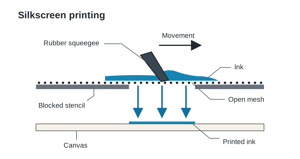
- Silkscreen printing: In late 1962 Warhol adopted photographic silkscreen printing to remove his personal hand from the work, pushing ink through fine mesh screens with a rubber squeegee. From 1963–64 he worked with assistants in his silver-foil-lined New York studio, The Factory, producing images in rapid workshop runs. Warhol welcomed misregistrations, uneven ink smudges, and faded prints, turning the flaws of industrial printing into symbols of consumer desensitisation.
Roy Lichtenstein (1923–1997)
Lichtenstein took panels from cheap romance and combat comic books, projecting and magnifying them onto immense gallery canvases to create visual parody.
- Whaam! (1963):** A two-panel work measuring over four metres wide. It shows an American fighter jet firing a rocket that blows an enemy aircraft apart in a burst of yellow, red, and white paint, framed by the bold onomatopoeic word 'WHAAM!'. Lichtenstein contrasted the life-and-death violence of modern warfare with a detached, commercial illustration style.
- Drowning Girl (1963):* Lichtenstein's partner work to Whaam!*. Adapted from a DC comic panel, it shows a young woman weeping in swirling blue waters, surrounded by a thought balloon reading: 'I don't care! I'd rather sink — than call Brad for help!'. The emotional melodrama is completely flattened by the cool graphic presentation.
- Ben-Day dots: In commercial printing, Ben-Day dots were small, mechanically spaced dots of cyan, magenta, yellow, and black used to create colour gradations cheaply on newsprint. Lichtenstein reproduced these dots by hand on canvas, pushing oil and magna paint through perforated metal screens with a stencil brush. Unlike Georges Seurat's nineteenth-century Pointillism, which used dots of pure colour for optical blending, Lichtenstein's dots highlighted the artificial, mechanical printing process.
Minimalism, Arte Povera, and Conceptual Art
During the mid-1960s and 1970s, artists discarded narrative and expressive brushwork, asking what remains when illusion and personal emotion are stripped away.
Minimalism
Minimalist sculptors avoided carved stone or cast bronze, preferring industrial, prefabricated materials arranged in simple geometric systems.
- Carl Andre (1935–2024), Equivalent VIII (1966):* An arrangement of 120 ordinary firebricks assembled on the gallery floor in a rectangle two bricks high, six bricks wide, and ten bricks long. There is no plinth, no carved surface, and no colour beyond the dull orange-grey of the baked clay. The work shifts attention from the hand of the artist to the physical presence of the bricks and the space the viewer occupies while walking around them.
Arte Povera
In Italy, critic Germano Celant named Arte Povera ('poor art') in 1967. While American Minimalists used polished factory-made steel and aluminium, Italian artists rejected commercial luxury by using cheap, natural, or discarded materials such as earth, rags, twigs, and newspaper.
- Michelangelo Pistoletto (born 1933), Venus of the Rags (1967):* A neoclassical white plaster statue of Venus, goddess of beauty, facing away from the viewer toward a large heap of tangled, brightly coloured second-hand clothing. The hard, smooth, classical figure is physically outweighed and confronted by modern consumer waste.
Conceptual Art and Bodily Action
Conceptual artists argued that the concept or idea is the primary artwork, while the physical object is purely secondary.
- Joseph Kosuth (born 1945), One and Three Chairs (1965):* Kosuth placed three versions of a chair together: a real wooden folding chair, a life-size black-and-white photograph of that chair in the gallery, and an enlarged photographic print of a dictionary definition of 'chair'. The work questions which version holds the true reality of a chair: the functional object, the visual picture, or the written code of language.
- Marina Abramović (born 1946), Rhythm 0 (1974):* In Studio Morra, Naples, Abramović stood motionless for six hours. On a nearby table sat 72 items that visitors were invited to use on her passive body as they chose, including a feather, a rose, wine, scissors, razor blades, and a loaded pistol. As the hours passed, the audience became aggressive, cutting her clothes and skin. The artwork was not an object on the wall, but the live social and ethical behaviour of the audience.
- Land Art: In Spiral Jetty (1970), Robert Smithson built a 460-metre coil of black basalt rock and mud extending into the Great Salt Lake, Utah. By building on a monumental scale in the natural landscape, Smithson took art outside the commercial gallery system, allowing natural water levels and salt crystallisation to alter the work over time.
European Sculpture, Installation, and Public Art
European sculptors after 1960 moved away from figurative bronze monuments, using site-specific public sculpture and architectural casting to explore memory, loss, and community history.
Rachel Whiteread (born 1963)
Whiteread casts the negative space inside or around everyday objects and architectural structures, using materials like plaster, resin, and concrete.
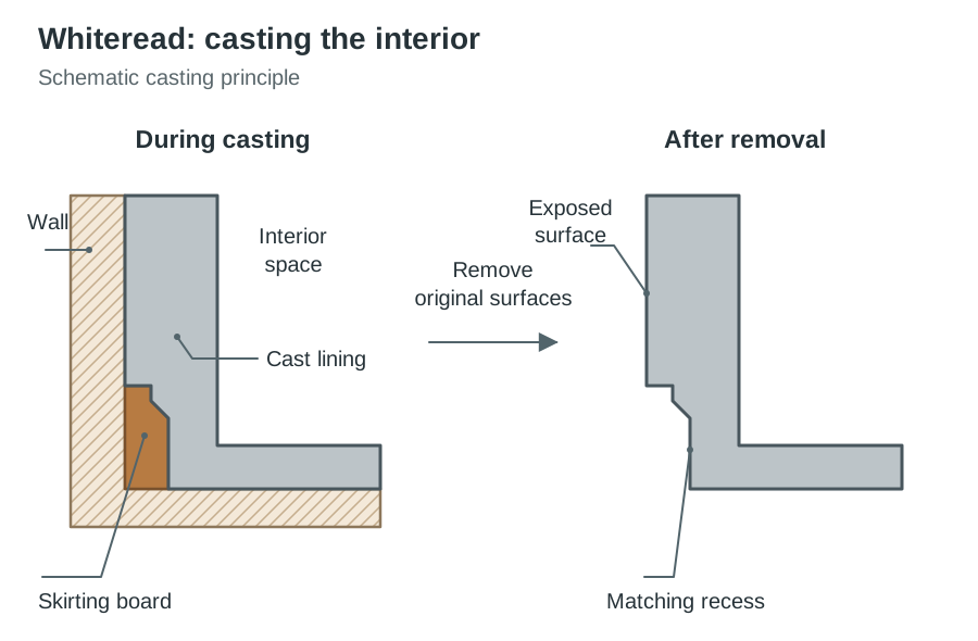
- House (1993):** Whiteread's breakthrough public installation. She sprayed liquid concrete against the interior walls of a condemned three-storey Victorian terraced home in Bow, East London. Once the concrete cured, the outer brick shell was peeled away, leaving a solid, grey monument of the interior void standing alone on the street. Window reveals, fireplace soot, and the texture of wooden skirting boards were permanently imprinted into the concrete surface. The work addressed the loss of working-class communities and London's housing policy before it was demolished by the local council in 1994.
- Ghost (1990):** Whiteread's partner work. A plaster cast of the interior of an entire Victorian living room, capturing the fireplace, door, and window frames in stark white plaster blocks, turning an intimate private room into a mausoleum-like monument.
Antony Gormley (born 1950)
Gormley uses casts of his own body to interrogate human vulnerability, industrial heritage, and the relationship between sculpture and open landscape.
- Angel of the North (1998):** Located in Gateshead, Tyne and Wear, this monumental sculpture stands 20 metres high with a horizontal wingspan of 54 metres. Built from 200 tonnes of weathering Cor-Ten steel that oxidises into a rich rust-orange coating, it was fabricated using local shipyard construction methods on the site of a former coal colliery. The vast horizontal emphasis of the wings anchors the vertical figure into the landscape, serving as a public monument to the industrial labour of north-east England.
- Another Place (1997):** Gormley's partner installation, consisting of 100 solid cast-iron figures modelled on the artist's body, spread across three kilometres of Crosby Beach, Merseyside. Submerged and revealed by the Atlantic tide, the figures collect barnacles and rust, reflecting human exposure to nature and deep geological time.
Neo-Expressionism in Europe and America
In the late 1970s and 1980s, Neo-Expressionism emerged as a direct reaction against the cool detachment of Pop Art and the austere geometries of Minimalism. Painters brought back the human figure, historical trauma, rich narrative, and thick paint.
Anselm Kiefer (born 1945)
Kiefer confronted the silence surrounding Germany's Nazi past through vast, heavily encrusted canvases mixing paint with unconventional materials such as lead, ash, burnt earth, and straw.
- Margarete (1981):* Measuring roughly 2.8 metres wide, this painting was inspired by Paul Celan's concentration-camp poem Death Fugue*, which contrasts the Aryan blonde hair of Margarete with the dark ash hair of the Jewish Shulamith. Kiefer glued real straw across the canvas and scorched it, painting heavy black acrylic lines of a ploughed field that converge toward a high horizon line. The thick texture makes the work resemble a sculptural relief. The burnt straw is not just a picture; it is the physical soil and scarred memory of German history.
- Nigredo (1984):** Kiefer's partner work, a monumental landscape in oil, acrylic, emulsion, shellac and straw on canvas, showing a scorched, furrowed field receding in steep perspective. The blackened earth references both agricultural cycles and the burnt landscapes of wartime Europe.
- Georg Baselitz (born 1938): Inverted his painted figures from 1969 onwards, as in The Wood on its Head (1969). By turning his subjects upside down, Baselitz forced viewers to look at the violent brushwork, raw colour, and painterly surface rather than relying purely on narrative.
Jean-Michel Basquiat (1960–1988)
Basquiat rose from the New York street scene to become the leading American voice in Neo-Expressionism, introducing a visual language that addressed racism, anatomy, and cultural heritage.
- SAMO© and Street Origins: In the late 1970s, Basquiat collaborated with Al Diaz spray-painting satirical, poetic critiques across Lower Manhattan under the tag SAMO© ('Same Old Shit'). Moving into studio painting in 1980, he retained the raw energy, symbols, and urgent text of the street.
- Untitled (Skull) (1981):* A monumental canvas depicting an exposed human head constructed through layers of acrylic, oilstick, and crayon. Having read Henry Gray's Gray's Anatomy while recovering from a childhood car accident, Basquiat exposed cranial bones, teeth, and internal flesh. The head acts as both an anatomical self-portrait and a modern memento mori*, reflecting psychological trauma and racial injustice.
- Irony of a Negro Policeman (1981):** Basquiat's partner work. Depicts a tall, mask-faced Black police officer wearing a uniform and a stylised cage-like hat, surrounded by scrawled and crossed-out words. Basquiat attacked the irony of a Black man enforcing laws within a white-dominated judicial system that oppresses his own community.
- The Crown Motif and the Griot: Basquiat crowned his heroes—such as jazz musicians Charlie Parker and Dizzy Gillespie, Black boxing champions, and himself. The three-pointed crown functioned as a reclamation of dignity, elevating Black figures into royalty within Western art. Functioning as a modern griot (a West African oral historian), he layered text and deliberately crossed out words, explaining: 'I cross out words so you will see them more; the fact that they are obscured makes you want to read them.'
Postmodernism, Appropriation, and Lens-Based Media
During the late 1970s and 1980s, Postmodernism rejected Modernist claims of continuous progress, originality, and absolute truth. Artists turned to appropriation—borrowing pre-existing images, media tropes, or cultural artefacts to dismantle their original meaning.
Barbara Kruger (born 1945)
Kruger worked as a graphic designer and picture editor for Condé Nast magazines, directly absorbing the persuasive mechanics of commercial advertising.
- Untitled (I shop therefore I am) (1987):** Kruger overlaid a cropped black-and-white photograph of a hand holding a printed card with white Futura Bold Oblique text on a red background. By subverting René Descartes' philosophical statement ('I think, therefore I am'), she critiqued consumer capitalism, arguing that under modern media, personal identity is defined entirely by what we purchase.
- Untitled (Your body is a battleground) (1989):** Kruger's partner work. Created for the 1989 women's reproductive rights march in Washington D.C., it presents a woman's face split down the middle into positive and negative photographic exposures, bisected by red text panels. The work functions simultaneously as an activist street poster and a gallery work.
Cindy Sherman (born 1954)
Sherman uses photography to expose how identity is staged and conditioned by media culture.
- Untitled Film Stills (1977–1980):* A series of 69 staged black-and-white gelatin silver prints, each measuring about 8 x 10 inches (20 x 25 cm). Acting as model, director, makeup artist, and stylist, Sherman photographed herself playing generic female archetypes from 1950s Hollywood B-movies and film noir—the anxious career girl (Untitled Film Still #21*), the vulnerable runaway, and the suspicious housewife. Because the movies never existed, Sherman proved that female identity in popular culture is an artificial masquerade.
- Untitled #96 (1981):* Sherman's partner work. A large colour photograph from her Centerfold* series. Shot from above, it shows a young girl lying on linoleum clutching a torn newspaper classified ad, lit with warm amber tones that mimic the framing of commercial magazines while undermining the voyeuristic gaze.
New Media, Video Art, and the Reinvention of Painting
Technological innovation expanded rapidly from the late twentieth century onwards, giving rise to New Media Art, which uses electronics, moving images, and digital code.
Video and Electronic Art
- Nam June Paik (1932–2006), TV Buddha (1974):* An eighteenth-century stone Buddha sits opposite a small television monitor and a closed-circuit video camera. The camera records the Buddha and displays its image in real time on the screen. The statue appears locked in endless contemplation of its own electronic reflection, setting Eastern spirituality against Western consumer electronics.
- Bill Viola (1951–2024), Nantes Triptych (1992):* A monumental video installation using three large fabric screens arranged in an altarpiece triptych format. The left screen shows real footage of a woman giving birth; the right screen shows Viola's mother dying in a hospital bed; the central screen shows a fully clothed figure floating underwater, drifting between light and darkness. Viola slows the video playback to an extreme degree, transforming medical reality into a silent, universal meditation on human existence.
- Ai-Da (2019): A humanoid robot artist named after mathematician Ada Lovelace, developed by gallerist Aidan Meller. Using ocular cameras and generative algorithms, Ai-Da controls a robotic arm to draw and paint, prompting debates over whether machine learning constitutes authentic creative intent.
- Format Obsolescence: Unlike traditional oil paintings, digital and video artworks face hardware and software deterioration, requiring museums to use data emulation and migration to keep works playable.
The Reinvention of 21st-Century Painting
Far from disappearing in the computer age, contemporary painting has experienced a major resurgence, using tactile surfaces to explore identity and cultural history.
- Jadé Fadojutimi (born 1993): Creates monumental abstract canvases combining gestural marks in oil, oil bar, and acrylic. Her dense layers of violet, emerald, and electric blue explore memory and emotional vulnerability, showing how expressive painterly abstraction remains vital in twenty-first-century collections, including Tate.
Patronage, the Art Market, and Wider Visual Culture
Who pays for art, who shows it, and who buys it all shape which artists we end up studying. High-scoring answers demonstrate an awareness of commercial galleries, private collectors, and public institutions.
Dealers, Collectors, and the Market
- Leo Castelli (1907–1999): The influential New York art dealer who discovered and promoted Jasper Johns, Robert Rauschenberg, and Roy Lichtenstein, establishing international commercial value for Pop Art.
- Charles Saatchi (born 1943): The advertising executive whose private collecting and 1997 Sensation exhibition at the Royal Academy brought the Young British Artists (YBAs)—including Damien Hirst and Rachel Whiteread—to global attention. Saatchi commissioned Hirst's The Physical Impossibility of Death in the Mind of Someone Living (1991), demonstrating how private patronage can manufacture public art history.
- Auction Value: In 2017, Basquiat's Untitled (1982 skull painting) sold at Sotheby's for $110.5 million, illustrating the paradox of an artist who began as an anti-establishment street tagger becoming one of the most commodified painters in history.
Wider Visual Culture
The Visual Studies specification requires students to connect fine art with everyday visual culture, including architecture, fashion, and commercial design:
- High-Tech Architecture: Renzo Piano and Richard Rogers designed the Centre Pompidou in Paris (opened 1977). They turned the building 'inside out' by placing structural steel trusses, air ducts, water pipes, and glass escalators on the exterior facade in bright industrial colour-codes, celebrating infrastructure much like Pop Art celebrated industrial products.
- Fashion: In 1966, the Campbell Soup Company capitalised on Warhol's fame by manufacturing paper disposable Souper Dresses, turning gallery Pop imagery directly into consumer streetwear.
- Album Design: Fine artists worked directly in commercial music: Warhol designed the peelable screenprinted banana cover for The Velvet Underground & Nico (1967), while Peter Blake and Jann Haworth assembled a Pop Art collage of life-size cardboard cut-outs for The Beatles' Sgt. Pepper's Lonely Hearts Club Band (1967).
After the Period: Legacy and Effects on Later Art
The Visual Studies Framework requires you to explain the effects of a movement on later art. Pop Art, Minimalism, and Conceptual art transformed the creative landscape for future generations:
- The collapse of high and low art: Pop Art permanently broke down the boundary between commercial graphic culture and fine art. Its direct descendants are the appropriation artists of the 1980s (Kruger, Sherman) and Neo-Pop figures like Jeff Koons, whose stainless-steel sculpture Rabbit (1986) casts an inflatable dime-store toy into high-gloss luxury metal.
- The idea as medium: Conceptual art and Arte Povera proved that the physical object is optional. Text, performance, data, live plants, and video are now standard gallery materials, explaining why installation and socially engaged actions dominate events like the Venice Biennale and the Turner Prize.
- The artist as manager and brand: Warhol's Factory model—employing teams of assistants to execute mechanical editions—paved the way for contemporary artists like Damien Hirst and Takashi Murakami, who run large production studios where the artist acts as director and brand manager.
Closing your examination answers with a clear statement on these long-term effects earns valuable marks under the framework's 'After the period' requirement.
Key terms
- Postmodernism
- A cultural movement emerging from the late 1960s that rejected Modernist beliefs in progress, universal truth, and artistic purity, championing irony, appropriation, and pluralism.
- Pop Art
- An art movement emerging in Britain and the United States in the mid-1950s that used imagery from advertising, comic books, consumer products, and mass media.
- Readymade
- An everyday manufactured object selected and designated as an artwork by an artist, proving that intellectual choice rather than manual skill can define art.
- Combine
- A hybrid format developed by Robert Rauschenberg in the 1950s that merges oil painting with real three-dimensional found objects and urban debris.
- Silkscreen printing
- A mechanical printing technique where ink is forced through a prepared fine mesh screen onto canvas or paper using a squeegee; Warhol used photographic screens to mass-produce images.
- Ben-Day dots
- A commercial printing method using small, regular coloured dots to build tone and colour in newsprint; Lichtenstein hand-painted these dots using perforated stencils.
- Appropriation
- The deliberate borrowing, copying, or recontextualising of pre-existing images, branded logos, or cultural objects to critique their original meaning.
- Arte Povera
- An Italian art movement of the late 1960s ('poor art') that rejected commercial industrial finish by using cheap, natural, or discarded everyday materials like rags, earth, and twigs.
- Neo-Expressionism
- A late 1970s and 1980s movement reviving intense, gestural figurative painting, human emotion, and rich narrative in reaction against Minimalism and Conceptual art.
- Griot
- A traditional West African storyteller, poet, and oral historian; referenced by Jean-Michel Basquiat to define his role in recording Black historical narratives and urban experience.
- Format obsolescence
- The breakdown or disappearance of electronic playback equipment, software, or operating systems over time, requiring museums to migrate and emulate digital artworks.
- Recognised artist
- An artist whose significance is established through public benchmarks: represented in standard art history texts, held in public museum collections, exhibited widely, or awarded public commissions.
Check yourself
Name three art elements you can discuss in Warhol's Marilyn Diptych (1962) and provide one observed detail for each.
Colour: out-of-register turquoise eyeshadow and crimson lips on the left panel; tone: over-inked black silhouettes and ink-starved faded faces on the right panel; rhythm and repetition: a rigid five-by-five grid of 25 portraits on each panel.
Which London group laid the groundwork for British Pop Art from 1952, and in which two collages does the word 'POP' appear?
The Independent Group (IG) at the ICA; the word 'POP' appears in Eduardo Paolozzi's I Was a Rich Man's Plaything (1947) and Richard Hamilton's Just what is it that makes today's homes so different, so appealing? (1956).
How did Roy Lichtenstein's use of Ben-Day dots differ technically and conceptually from Georges Seurat's Pointillism?
Seurat applied dots of pure oil paint for optical colour mixing in the viewer's eye; Lichtenstein painted dots by hand through perforated stencils to parody the cheap, mechanical four-colour printing of commercial comic books.
What materials did Anselm Kiefer combine in 'Margarete' (1981), and what historical context underpins the painting?
Kiefer combined oil, acrylic, emulsion, and real burnt straw on canvas; the work confronts post-WWII German silence surrounding the Holocaust, referencing Paul Celan's concentration-camp poem Death Fugue.
Describe Rachel Whiteread's technique in 'House' (1993) and explain its symbolic meaning.
Whiteread sprayed liquid concrete into the interior of a condemned Victorian terraced house before removing the exterior brickwork, casting negative space into a solid monument exploring memory and social housing loss.
What was the purpose of Cindy Sherman playing every role herself in the 'Untitled Film Stills' (1977–1980)?
By styling, posing, and photographing herself as fictional female stereotypes from cinema, Sherman demonstrated that female identity in mass media is an artificial, manufactured masquerade.
How does Joseph Kosuth's 'One and Three Chairs' (1965) represent the core philosophy of Conceptual Art?
It presents a real chair, a photograph of it, and a dictionary definition side by side, proving that the idea and definition of an object are more central to art than manual craftsmanship.